Which Fonts Should I Use When Designing a Business Card?


Which Fonts Should I Use When Designing a Business Card?
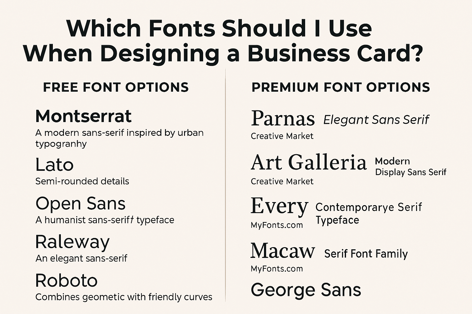
A business card is often the first tangible impression someone has of your brand. The font you choose plays a pivotal role in conveying professionalism, personality, and readability. Selecting the right typeface ensures your card stands out and communicates effectively. Below, we've curated a list of both free and premium font options, including selections from Creative Market and MyFonts, to assist you in crafting the perfect business card.
Free Font Options:
-
Montserrat
A modern sans-serif font inspired by urban typography, Montserrat offers a clean and professional look suitable for various industries. -
Lato
With its semi-rounded details, Lato exudes warmth and stability, making it ideal for corporate and creative professionals alike. -
Open Sans
A humanist sans-serif typeface, Open Sans is highly readable and versatile, fitting for both body text and headings. -
Raleway
An elegant sans-serif font with a thin weight, Raleway adds a touch of sophistication to minimalist designs. -
Roboto
Combining geometric forms with friendly curves, Roboto is a balanced and legible choice for contemporary business cards.
Premium Font Options:
-
Parnas: Elegant Sans Serif
Available on Creative Market, Parnas features sharp and smooth lines, offering a classic and refined appearance. -
Art Galleria: Modern Display Sans Serif
Also from Creative Market, Art Galleria provides uniquely shaped alternates and ligatures, perfect for artistic and modern designs. -
Every: Contemporary Serif Typeface
This font redefines traditional serifs with a clean and symmetrical design, enhancing readability in smaller sizes. -
Macaw: Serif Font Family
Inspired by Roman typography, Macaw offers varied weights, allowing for emphasis and versatility in your design. -
George Sans
An elegant set of sans-serif fonts, George Sans provides a sleek geometric design, ideal for impactful business cards.
Tips for Choosing the Right Font:
-
Readability: Ensure the font is legible at various sizes, especially considering the limited space on a business card.
-
Brand Alignment: Select a typeface that reflects your brand's personality and industry standards.
-
Contrast: Pair fonts thoughtfully to create visual interest while maintaining harmony.
-
Test Prints: Always print a sample to see how the font appears in its physical form before finalizing your design.
Remember, the font you choose is a reflection of your brand's identity. Take the time to select a typeface that not only looks appealing but also communicates your message effectively.

