Typography & Brand Identity: Creating Emotion with Fonts
Typography & Brand Identity: Creating Emotion with Fonts
When it comes to brand identity, typography is more than just an aesthetic choice — it’s a powerful tool for shaping perceptions and evoking emotions. Fonts are subtle, yet they play a critical role in how a brand communicates its message and connects with its audience. Whether you want to convey trust, excitement, luxury, or approachability, the right font can make all the difference.
In this post, we’ll explore how typography influences brand identity through psychological effects, and take a look at real-world examples of brands that have mastered the art of using fonts to create emotional connections.
Psychological Effects of Typography on Brand Perception
1. Serif Fonts: Trust and Authority
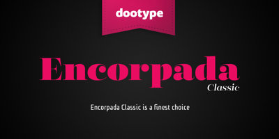
Serif fonts, with their elegant “feet” and “tails,” often communicate a sense of trustworthiness, tradition, and reliability. Because serif fonts are commonly used in print media, especially for long-form text (think newspapers, law books, or classic novels), they are perceived as more serious and authoritative.
-
Psychological Impact: Serif fonts can evoke a sense of prestige and professionalism, making them ideal for financial institutions, legal firms, and luxury brands.
-
Brand Examples: Brands like Times New Roman (for classic print) and Garamond often use serif fonts to reinforce the notion of authority and tradition.
Example: The New York Times uses a serif font to convey its legacy of trustworthiness, credibility, and journalistic authority. The use of a classic serif style helps the brand maintain a strong, reliable presence in the news industry.
Sans-Serif Fonts: Modernity and Simplicity
Sans-serif fonts, with their clean lines and lack of ornamentation, are often associated with modernity, simplicity, and clarity. These fonts tend to feel more approachable, contemporary, and easy to read, making them ideal for brands that want to project a sense of youthfulness and efficiency.
-
Psychological Impact: Sans-serif fonts evoke feelings of freshness, minimalism, and accessibility, making them suitable for tech companies, startups, and online platforms.
-
Brand Examples: Brands like Apple, Google, and Spotify use clean, modern sans-serif fonts to convey innovation, ease of use, and forward-thinking.
Example: Apple’s use of San Francisco (their custom sans-serif font) is sleek, minimalistic, and modern, reflecting their innovative, user-friendly, and premium identity. Their font selection perfectly matches their brand ethos of cutting-edge technology.
3. Script Fonts: Elegance and Creativity
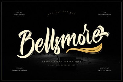
Script fonts, with their flowing and cursive style, often carry a sense of elegance, luxury, and creativity. They tend to evoke an emotional response because they resemble handwritten or personal text, adding a layer of warmth and intimacy.
-
Psychological Impact: Script fonts often feel personal, romantic, and artistic. They can create a connection with the audience by making them feel special and valued.
-
Brand Examples: Luxury brands or those in the wedding and beauty industries often use script fonts to communicate exclusivity and high-end craftsmanship.
Example: Coco Chanel’s use of elegant script fonts in their logo evokes a sense of timeless luxury, while conveying sophistication and femininity. The handwritten style of their font suggests personal craftsmanship and exclusivity.
Display Fonts: Boldness and Distinction
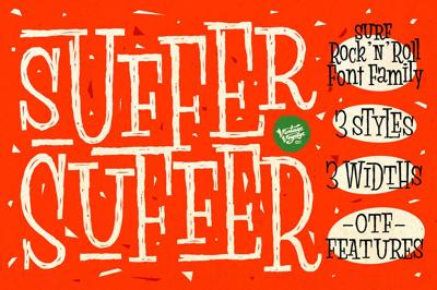
Display fonts are highly stylized fonts often used for headlines, logos, and attention-grabbing elements. They come in a variety of unique styles, from bold and geometric to art deco or vintage-inspired designs. These fonts are meant to make a statement.
-
Psychological Impact: Display fonts create a sense of uniqueness, boldness, and individuality. They make a strong, immediate impact, and are typically used to convey creativity, rebellion, or fun.
-
Brand Examples: Many entertainment and fashion brands use display fonts to create a distinctive, memorable presence in a crowded market.
Example: Netflix’s bold, minimalistic sans-serif logo combined with the unique display typeface captures the excitement and energy of modern entertainment. The simple design with a bold statement ensures that the brand feels fresh, trendy, and highly recognizable.
How Typography Reflects a Brand's Identity
Typography isn’t just about how a word looks — it’s about how it makes you feel. The right font can immediately evoke a range of emotions from a potential customer and help reinforce the core values of the brand. Here's how typography shapes overall brand identity:
-
Tone of Voice: Typography is a key part of the “tone” your brand projects. A playful, round script font can make a brand feel more fun and welcoming, while a strong, bold serif font might communicate power and trust.
-
Consistency: Using consistent typography across all brand touchpoints (website, ads, packaging, etc.) helps solidify your brand identity. For instance, Coca-Cola’s script font has remained iconic and consistent over the years, further strengthening its association with happiness, refreshment, and nostalgia.
-
Psychological Triggers: Fonts influence how people feel. Soft, round fonts may evoke calmness, while sharp, angular fonts might feel intense or aggressive. Brands use this to their advantage by selecting fonts that align with their desired emotional response from their audience.
Choosing the Right Font for Your Brand
When selecting a font for your brand, consider the following:
-
Audience: What emotional reaction do you want to elicit? A youthful audience might respond better to sans-serif fonts, while a high-end audience may appreciate the elegance of a serif or script font.
-
Brand Values: Does your brand reflect trust, innovation, elegance, or playfulness? Make sure your font choice aligns with these core principles.
-
Versatility: Choose fonts that are adaptable across various platforms and media, from digital to print. Consistent typography helps create a unified brand image.
Conclusion: Font as a Brand Language
Typography is more than just a design element — it’s a brand language. The fonts you choose convey a deep emotional message to your audience. By selecting the right fonts, you create a strong, emotional connection with your audience, reinforcing the essence of your brand.
Tip: Don’t just choose a font because it’s stylish — choose one that resonates with your brand’s values and message. Typography is a tool that can create lasting emotional connections.


