The Ultimate Guide to Choosing the Perfect Font for Your Brand
The Ultimate Guide to Choosing the Perfect Font for Your Brand
Your brand's typography is more than just letters on a page—it's the silent ambassador of your business identity. In today's competitive marketplace, choosing the perfect font can make the difference between a memorable brand and one that gets lost in the crowd. Whether you're launching a startup or rebranding an established company, understanding typography fundamentals will elevate your brand's visual communication.
Why Typography Matters for Your Brand Identity
Typography serves as the foundation of visual communication, directly impacting how customers perceive your business. Research shows that consumers form opinions about brands within milliseconds, and typography plays a crucial role in this snap judgment. The right font choice can convey professionalism, creativity, trustworthiness, or innovation—all without saying a word.
Consider how luxury brands like Tiffany & Co. use elegant serif fonts to communicate sophistication, while tech companies like Google employ clean, modern sans-serif typefaces to project innovation and accessibility. These strategic font choices reinforce brand positioning and create emotional connections with target audiences.
Understanding Font Categories and Their Brand Personalities
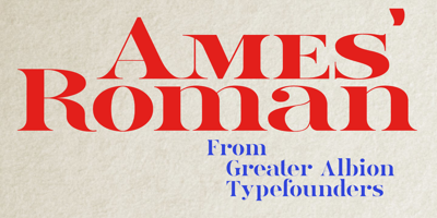
Serif Fonts: Traditional and Trustworthy Serif fonts feature small decorative strokes extending from letter forms, making them ideal for brands seeking to establish credibility and tradition. Banks, law firms, and educational institutions often choose serif fonts because they evoke feelings of reliability and expertise. Times New Roman, Georgia, and Baskerville are classic examples that work well for professional services.
Sans-Serif Fonts: Modern and Clean Sans-serif fonts lack decorative strokes, creating clean, minimalist appearances perfect for contemporary brands. Technology companies, healthcare organizations, and modern retail brands frequently select sans-serif typefaces to communicate efficiency and forward-thinking approaches. Helvetica, Arial, and Futura remain popular choices for their versatility and readability.
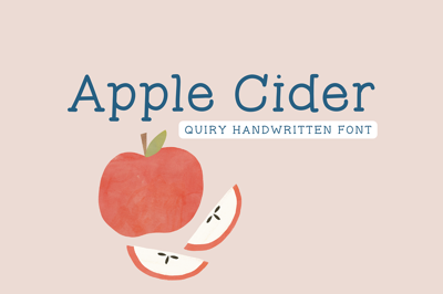
Script Fonts: Creative and Personal Script fonts mimic handwriting, adding personality and warmth to brand communications. These fonts work exceptionally well for creative industries, boutique businesses, and brands emphasizing personal connections. However, script fonts require careful consideration as they can be difficult to read in small sizes or digital applications.
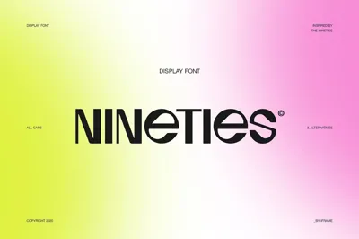
Display Fonts: Bold and Distinctive Display fonts are designed for headlines and short text, offering unique character that sets brands apart. These fonts work best for entertainment, fashion, or artistic brands wanting to make strong visual statements. Use display fonts sparingly to maintain readability while creating memorable impressions.
The Psychology Behind Font Selection
Typography psychology reveals how different font characteristics influence reader emotions and perceptions. Angular fonts with sharp edges often convey strength and masculinity, while rounded fonts with soft curves suggest friendliness and approachability. Understanding these psychological triggers helps brands align typography with desired emotional responses.
Weight and spacing also impact perception. Bold fonts command attention and suggest confidence, while lighter weights appear more elegant and sophisticated. Letter spacing affects readability and mood—tight spacing creates urgency, while generous spacing feels luxurious and relaxed.
Free Font Resources for Budget-Conscious Brands
Building a strong brand doesn't require expensive typography licenses. Numerous high-quality free font options provide professional results without straining budgets. Google Fonts offers an extensive library of web-optimized free font families suitable for both digital and print applications. Popular choices include Open Sans, Lato, and Montserrat, which provide excellent readability across all platforms.
Font Squirrel curates premium-quality free font collections, ensuring proper licensing for commercial use. Their collection includes both classic and contemporary options suitable for various brand personalities. Adobe Fonts (formerly Typekit) provides access to thousands of fonts with Creative Cloud subscriptions, making it an affordable option for design professionals.
When selecting a free font, always verify licensing terms to ensure commercial usage rights. Some fonts require attribution or have restrictions on commercial applications, so careful review prevents legal complications down the road.
Technical Considerations for Font Implementation
Web Typography Requirements Modern websites require fonts that load quickly and display consistently across devices and browsers. Web fonts must be optimized for various screen sizes, ensuring readability on smartphones, tablets, and desktop computers. Consider font loading speeds, as slow-loading typography can negatively impact user experience and search engine rankings.
Print vs. Digital Applications Fonts that work beautifully in print may not translate well to digital screens, and vice versa. Screen fonts require higher x-heights and wider letter spacing for optimal readability, while print fonts can feature more delicate details and tighter spacing. Many brands choose font families offering both screen and print variations to maintain consistency across all touchpoints.
Brand Consistency Across All Touchpoints
Once you've selected your brand fonts, consistency becomes paramount. Develop typography guidelines specifying primary and secondary font choices, sizing hierarchies, and usage rules. Document these standards in a brand style guide that team members and external partners can reference.
Consider how your chosen fonts will appear across business cards, websites, social media graphics, packaging, and advertising materials. Test typography in various sizes and applications before finalizing decisions, ensuring optimal performance in all brand contexts.
Testing and Refining Your Font Choices
Before committing to specific fonts, conduct thorough testing with your target audience. Create mockups showing your fonts in realistic brand applications, then gather feedback from customers, employees, and design professionals. Pay attention to readability, emotional response, and brand alignment.
A/B testing can provide valuable insights into font performance, particularly for digital applications. Test different fonts in email campaigns, website headers, or social media posts to measure engagement and conversion rates. Data-driven decisions often reveal surprising insights about audience preferences.
Common Font Selection Mistakes to Avoid
Many brands make critical typography errors that undermine their professional image. Using too many fonts creates visual chaos and confuses brand identity. Stick to two or three complementary fonts maximum—typically one for headers and another for body text.
Avoid trendy fonts that may quickly become dated, unless your brand specifically targets trend-conscious audiences. Classic, timeless fonts provide better long-term value and maintain professional appearance as design trends evolve.
Poor readability represents another common mistake. Prioritize legibility over creativity, especially for small text or mobile applications. Beautiful fonts mean nothing if customers can't read your message clearly.
Conclusion: Building Your Typography Strategy
Choosing the perfect font for your brand requires balancing aesthetic appeal with functional requirements. Consider your brand personality, target audience, and technical needs when making typography decisions. Remember that great fonts serve your brand message rather than overwhelming it.
Start with a solid free font foundation, then invest in premium typography as your brand grows. Document your choices in comprehensive brand guidelines, and consistently apply your typography across all brand touchpoints. With careful planning and strategic implementation, your font choices will strengthen brand recognition and enhance customer connections for years to come.
The investment in thoughtful typography pays dividends through improved brand perception, increased customer trust, and stronger market positioning. Take time to choose wisely—your brand's future depends on these fundamental design decisions.
