The Psychology of Typography: What Your Font Says About You
The Psychology of Typography: What Your Font Says About You
Every piece of communication—from a logo to an email signature—is sending a message. And that message is shaped not just by the words you use, but by the font they are written in. Your choice of typeface is a powerful, non-verbal cue that impacts perception, trustworthiness, and emotion.
In the world of design, this isn't guesswork; it's the psychology of typography.
Before a customer even processes your brand name, their brain has already registered the font's visual cues: Is this reliable? Is it modern? Is it cheap or expensive? Understanding this subconscious reaction allows you to choose a typeface that speaks the exact language of your brand personality.
Here is a breakdown of what the major font categories communicate about your business, your product, and your values.
1. The Serif: Trust, History, and Respect
Serif fonts, with their little "feet" or strokes at the ends of letterforms, carry the weight of history. They are the original typefaces, rooted in ancient Roman carving and classical printing.
The Message It Sends:
-
Established and Authoritative: Serifs convey a deep sense of tradition and reliability. They suggest that your brand has been around, knows what it’s doing, and is built to last.
-
Formal and Elegant: They elevate the perceived status of the content. High-contrast serifs (those with dramatic thick and thin strokes) are particularly associated with luxury and sophistication.
-
Comfortable for Long Reads: Psychologically, serifs are viewed as being easier to read in large blocks of text (like books or newspapers) because the serifs help the eye flow along the line of text.
When to Choose a Serif:
-
Branding: Law firms, financial institutions, premium consumer goods, and high-end fashion.
-
Content: Books, lengthy reports, academic papers, and major news websites.
-
The Vibe: "We are knowledgeable, trustworthy, and sophisticated." (Think: Times New Roman, Garamond, Playfair Display.)
2. The Sans-Serif: Modernity, Clarity, and Speed
Sans-serif fonts lack the decorative feet, offering clean, crisp lines. They rose to prominence in the 20th century as part of the modernist movement, emphasizing function and efficiency.
The Message It Sends:
-
Clarity and Simplicity: Sans-serifs are direct, transparent, and easy to scan. They prioritize function, making them excellent for quick absorption of information.
-
Modern and Accessible: They are the visual language of technology and the internet. They suggest that your brand is innovative, forward-thinking, and easy to interact with.
-
Friendly and Approachable: Especially those with rounded edges (humanist designs). They feel less rigid than their formal serif counterparts.
When to Choose a Sans-Serif:
-
Branding: Tech startups, mobile apps, SaaS companies, and consumer electronics.
-
Content: Website body text, app user interfaces (UI/UX), infographics, and presentation slides.
-
The Vibe: "We are smart, efficient, and user-friendly." (Think: Helvetica, Roboto, Open Sans, Montserrat.)
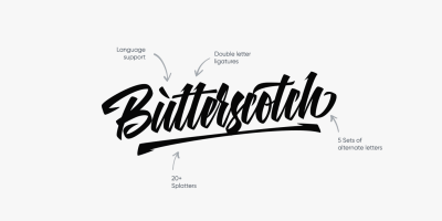
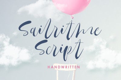
3. Script and Handwritten Fonts: Personality and Emotion
These fonts mimic human handwriting, brush strokes, or calligraphy, adding an undeniable, personal flair.
The Message It Sends:
-
Uniqueness and Creativity: They suggest a hands-on, artistic, or personalized touch. They break from the corporate norm to show off personality.
-
Femininity and Elegance: Flowing, thin scripts are often used to evoke romance, luxury, and delicate craftsmanship (e.g., wedding invitations).
-
Casual and Energetic: Brush or messy handwriting fonts communicate a spontaneous, youthful, or fun vibe.
When to Choose a Script/Handwritten Font:
-
Branding: Bakeries, artisanal products, personal blogs, photography, and boutique clothing.
-
Content: Used for logos, signatures, and short, emotional headlines.
-
The Vibe: "We are artistic, personalized, and passionate." (Use sparingly! Never for body text.)
4. The Micro-Cues That Matter
Beyond the main categories, the subtle features of a font fine-tune your message:
-
Weight (Thickness): A bold, heavy font communicates strength, importance, and urgency. A thin, light font communicates delicacy, luxury, and minimalism.
-
Case: All caps demand attention (e.g., newspaper headlines) but can feel like shouting. Lowercase feels softer and more casual.
-
X-Height (Lowercase Letter Height): Fonts with a tall X-height are easier to read at small sizes and feel more open. Fonts with a short X-height feel more traditional and elegant.
The fonts you choose for your brand are arguably the most powerful yet silent ambassadors of your identity. By intentionally matching your typeface to your intended emotional message, you ensure every piece of design reinforces exactly who you are and builds trust with your audience.


