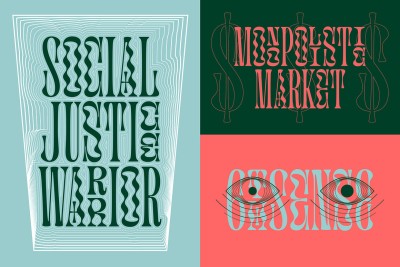
The Psychology of Fonts: How to Choose the Right Font for Your Audience
The Psychology of Fonts: How to Choose the Right Font for Your Audience
When it comes to design, typography isn’t just about picking a font that looks good. It’s about choosing the right font for your audience, your message, and the emotions you want to evoke. Fonts have a profound psychological impact on how we interpret and connect with text, often without us even realizing it. The psychology of fonts is a powerful tool that can influence everything from brand perception to reader engagement.
Let’s dive into the world of typography and explore how to choose the right font to speak to your audience in the most effective way.
1. Understanding the Power of Fonts
Fonts are more than just letters and numbers arranged on a page. They carry a personality and evoke certain feelings. Think about the last time you saw a logo or a product label. Did the font make you feel confident, playful, or professional? That’s the psychology of fonts at work.
Fonts can be categorized into various families, each carrying its own psychological baggage:
-
Serif Fonts (e.g., Times New Roman, Georgia): These fonts, with their small lines or "serifs" at the end of each stroke, are often associated with tradition, reliability, and professionalism. They’re great for formal or academic settings and are typically used in print for newspapers and books. If your brand wants to exude trustworthiness and authority, serif fonts are a solid choice.
-
Sans-Serif Fonts (e.g., Helvetica, Arial): These clean, modern fonts without the extra strokes have become the go-to for contemporary, sleek designs. Sans-serif fonts are easy to read on digital screens, making them perfect for websites, apps, and social media. They’re often seen as friendly, simple, and approachable.
-
Script Fonts (e.g., Pacifico, Brush Script): With their cursive-like, fluid lines, script fonts can evoke elegance, creativity, and sophistication. However, they should be used sparingly since they can sometimes be harder to read. Think weddings, luxury brands, or anything that requires a touch of personal flair.
-
Display Fonts (e.g., Impact, Bebas Neue): These fonts are typically bold and eye-catching, often used for headlines or advertisements. Display fonts grab attention but can be overwhelming if overused. They work best when you want to make a statement or emphasize something important.
-
Monospaced Fonts (e.g., Courier, Consolas): Monospaced fonts, where each character takes up the same amount of horizontal space, are often associated with tech, coding, and vintage typewriters. They can bring a sense of precision and structure, which might be ideal for technical content or retro designs.
2. Matching Fonts to Your Audience
One of the most crucial aspects of font selection is knowing who your audience is and what kind of impression you want to leave on them. The psychological impact of a font varies across different demographic groups, so tailoring your typography to your target audience can make a significant difference.
-
Professional Audiences: If your audience is primarily business professionals, investors, or academics, you’ll want to lean toward fonts that convey trust, stability, and authority. Serif fonts like Times New Roman or Garamond are great choices for these settings. They exude professionalism and lend credibility to your content.
-
Creative or Young Audiences: For a younger, more creative audience, playful or trendy fonts like those in the sans-serif or script category might work better. Fonts like Futura or Comic Sans (yes, despite its controversial reputation, it can work for informal, fun contexts) appeal to a casual and energetic vibe.
-
Tech-Savvy Audiences: If your audience is in the tech space, you might want to opt for sleek and modern fonts that convey innovation and cutting-edge thinking. Fonts like Helvetica Neue or Roboto give off a contemporary, minimalist feel, ideal for tech companies, apps, and digital products.
-
Luxury or High-End Brands: For high-end products or luxury brands, choosing an elegant font like Didot or Bodoni can evoke sophistication and exclusivity. These fonts have an air of class that can elevate the perception of your brand.
3. Font Legibility and Readability
While aesthetics play a significant role in font choice, legibility is just as important. A beautifully designed font is useless if your audience can’t read it. Make sure your font selection matches the medium through which your content will be consumed.
-
Web Design: When designing for the web, it’s important to prioritize legibility, especially for body text. Sans-serif fonts like Arial or Open Sans are excellent choices for digital content since they are easy to read on screens of all sizes. Also, ensure that your font size and line spacing are optimized for reading comfort.
-
Print Design: For print, the traditional serif fonts still reign supreme for body text, as they are easier to read on paper. However, headlines or larger text can benefit from more creative fonts or display fonts, depending on the mood you want to set.
-
Mobile Devices: On smaller screens, clarity is key. Keep font sizes large enough for mobile users to read comfortably, and avoid overly decorative fonts that may cause eyestrain.
4. Pairing Fonts for Impact
In design, pairing fonts effectively can create a striking balance between aesthetic appeal and functional readability. A common rule of thumb is to pair a serif font with a sans-serif font, combining the formality and tradition of serifs with the clean, modern simplicity of sans-serif fonts.
For instance, you might use a bold serif font like Playfair Display for headlines, paired with a simpler sans-serif font like Lato for the body text. This creates a nice contrast, making your design both engaging and easy to read.
When pairing fonts, remember that less is often more. Stick to two or three fonts, at most, to avoid overwhelming your audience.
5. The Role of Context
Finally, consider the context in which the font will be used. A quirky, fun font might be great for a children's brand or a creative blog, but it may feel out of place for a law firm or a financial service. Aligning your font choice with the tone of your content and the expectations of your audience is essential.
-
Formal Contexts: Serif fonts, like Times New Roman or Baskerville, work well in formal, professional settings such as resumes, academic papers, or corporate websites.
-
Informal Contexts: Casual, approachable fonts like Comic Sans or Century Gothic are better suited for less formal environments, such as blogs, social media posts, or casual event invitations.
Conclusion: The Right Font Can Make All the Difference
Typography is a subtle yet powerful tool in design. The right font can make your content more engaging, convey your brand’s personality, and create the right mood for your audience. By understanding the psychology behind fonts and how different types evoke specific emotions, you can choose the perfect font to communicate effectively with your target demographic.
So, next time you’re designing a piece of content, whether it’s a website, social media post, or print ad, take a moment to think about the font you’re using. Choose wisely, and watch as your message resonates more deeply with your audience.
