Serif vs. Sans-Serif: When to Use Which in Your Designs
Serif vs. Sans-Serif: When to Use Which in Your Designs
It’s the oldest rivalry in the world of typography: Serif versus Sans-Serif. These two font families define the mood, readability, and professionalism of every single design project, from a logo to a book. Choosing the right one isn't just a matter of taste; it’s a strategic design decision.
If you’ve ever wondered why your logo feels too traditional, or why your website copy is hard to read, the answer often lies in whether you chose a font with "feet" or without.
Let's break down the distinct characteristics, psychological impact, and best use cases for both serif and sans-serif typefaces, ensuring you pick the perfect visual voice every time.
What Exactly is the Difference?
The distinction is simple and based on a physical feature of the letterforms:
-
Serif Fonts: These typefaces have small decorative lines or "feet" extending from the ends of the strokes of the letters. Think of fonts like Times New Roman or Garamond.
-
Sans-Serif Fonts: Sans is French for "without." These fonts lack those decorative feet, resulting in clean, uniform, and minimalist lines. Think of fonts like Arial or Helvetica.
The Serif: Tradition, Trust, and Texture
Serifs are the original typefaces, evolving from the carved letters of Roman antiquity. Their long history gives them a specific psychological weight.
Psychological Impact: Authority and Elegance
Serif fonts carry connotations of:
-
Tradition and History: They look established and timeless.
-
Trust and Authority: They are often associated with serious institutions like universities, law firms, and major newspapers.
-
Elegance and Sophistication: They feel classic, refined, and high-end.
When to Use Serif Fonts
Serif fonts truly shine in print and when you need to convey credibility.
-
Long-Form Print Content: The serifs guide the reader's eye from one letter to the next, helping connect the words into cohesive lines. This is why you see them used almost exclusively in books, magazines, and newspapers. They dramatically improve legibility in print.
-
Branding for Trust: If your brand needs to feel established, knowledgeable, or luxurious, a serif is the perfect choice. This works for high-end fashion, finance, fine dining, or journalism.
-
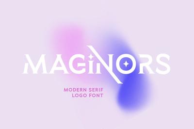
Headings for Contrast: Serifs can make exceptional display headings when used to contrast against sans-serif body copy. This combination (serif heading, sans-serif body) creates a great sense of visual hierarchy.
Top Free Serif Examples: Merriweather (great for screen reading), Playfair Display (elegant and high-contrast), EB Garamond (classic and formal).
The Sans-Serif: Modernity, Clarity, and Cleanliness
Sans-serif typefaces rose to prominence in the 20th century as a direct contrast to the formality of serifs. They stripped away the decorative elements to achieve ultimate clarity.
Psychological Impact: Modernity and Simplicity
Sans-serif fonts convey a sense of:
-
Modernity and Futurism: They feel contemporary, clean, and forward-thinking.
-
Clarity and Approachability: They are simple, direct, and easy to scan quickly.
-
Minimalism and Neutrality: They work well as a 'blank canvas' that doesn't distract from the content or imagery.
When to Use Sans-Serif Fonts
Sans-serif is the undisputed ruler of the digital world due to its optimized clarity on low-resolution screens.
-
Digital Body Copy: On a screen, especially at smaller sizes, the fine details of serifs can get lost or distorted (a process called "aliasing"), reducing readability. The clean lines of sans-serif fonts like Open Sans or Roboto render perfectly on mobile and desktop screens, making them the default choice for most websites, apps, and digital interfaces (UI/UX).
-
Logos and Branding for Approachability: Brands that want to appear accessible, innovative, or friendly often choose sans-serif. This is ideal for tech companies, fitness brands, and modern startups.
-
Infographics and Data: When clarity and immediate information absorption are critical, sans-serif is best. Use it for charts, graphs, technical manuals, and slide presentations.
Top Free Sans-Serif Examples: Montserrat (geometric and versatile), Open Sans (neutral and readable), Roboto (optimized for screen).
Strategic Font Pairing: The Best of Both Worlds
The most powerful typographic designs rarely rely on just one style. Instead, they use smart font pairing to leverage the strengths of both serifs and sans-serifs.
The most common and effective pairing is to use the two styles for different roles:
-
Rule 1: Contrast is Key: Pair a high-contrast serif (like Playfair Display) with a neutral sans-serif (like Open Sans). The difference helps separate the content into clear, distinct layers.
-
Rule 2: Roles: Assign the authoritative, elegant role to the Serif (usually for the Heading/Title) and the clear, utilitarian role to the Sans-Serif (for the Body Text).
-
Rule 3: Consistency: Make sure the overall height or weight of the two fonts feel harmonized, even if their styles are different.
By mastering the psychology and practical applications of the serif and the sans-serif, you move beyond merely choosing a font—you choose a strategic voice for your entire design.


