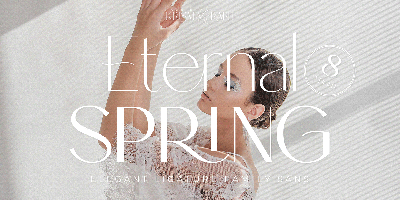
How to Choose the Right Free Font for Your Project
How to Choose the Right Free Font for Your Project
Choosing the right font is one of the most important steps in any design process. It can make or break the success of a project, whether you’re designing a website, a logo, or a marketing campaign. But with thousands of free fonts available online, how do you know which one will work best for your project?
In this guide, we’ll walk you through how to choose the perfect free font for your design project, taking into account factors like readability, style, tone, and functionality. And to make it even easier, we’ll point you toward some of the best free font resources, like FreeForFonts.com, where you can find fonts for personal and commercial use without worrying about licensing issues.
1. Consider Your Project’s Purpose
The first step in choosing a font is understanding the purpose of your project. The type of project will heavily influence the kind of font you should select.
-
For Websites: Fonts should be legible, especially for body text. Choose sans-serif fonts like Roboto or Open Sans for better readability on screens.
-
For Logos: Fonts should be unique and memorable. Fonts like Bebas Neue or Montserrat work well for bold, impactful logos.
-
For Branding: Fonts need to reflect your brand’s personality. A playful, handwritten font like Pacifico might suit a fun brand, while a more formal, serif font like Merriweather would suit a high-end business.
-
For Print: If you’re designing a brochure or poster, you want a font that will stand out at different sizes and ensure your message is clear. Fonts like Playfair Display or Lora are great for print materials because of their versatility in both headers and body text.
2. Focus on Readability
One of the primary concerns when choosing a font is readability. No matter how stylish a font may look, if it’s difficult to read, it can ruin the user experience and the effectiveness of your project.
-
Body Text: When choosing fonts for longer text blocks (such as articles, blogs, or reports), you want fonts that are easy on the eyes. Serif fonts like Lora or Crimson Pro are ideal for long-form text because they guide the reader’s eye.
-
Headings and Titles: For headlines, you can get a bit more creative with fonts that stand out. Sans-serif fonts like Raleway or Poppins work well for headings because they are bold and easily readable at larger sizes.
-
Size and Spacing: Make sure your font is legible in both small and large sizes. Test the font at various sizes to ensure it remains readable. Pay attention to line spacing and letter spacing, as these can affect how comfortable it is for the reader.
3. Understand the Tone of Your Project
Different fonts convey different emotions. The tone of your project should dictate the type of font you choose. For example, if you're designing for a law firm, a formal serif font like Georgia or Times New Roman will give off a trustworthy, professional vibe. On the other hand, if you're designing for a tech startup, a clean and modern sans-serif font like Helvetica or Roboto will better align with a sleek, innovative tone.
Here are some examples of font types and the tone they convey:
-
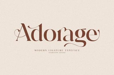
Serif Fonts: Classic, traditional, formal, trustworthy. Example: Merriweather
-
Sans-serif Fonts: Clean, modern, neutral, professional. Example: Open Sans
-
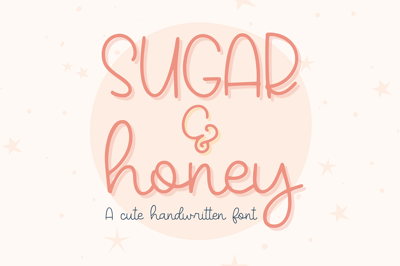
Script Fonts: Elegant, creative, sophisticated, friendly. Example: Dancing Script
-
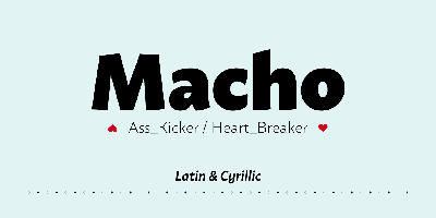
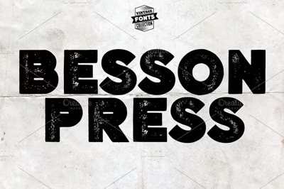
Display Fonts: Bold, expressive, playful, unique. Example: Bebas Neue
4. Match the Font to Your Brand’s Personality
Your font should reflect your brand’s personality. If your brand is casual and fun, choose fonts that feel approachable. If your brand is luxury and high-end, choose fonts that feel refined and elegant.
-
Minimalistic Brands: Go for clean and simple fonts like Helvetica Neue or Lato.
-
Fun and Creative Brands: Fonts with more personality, such as Pacifico or Indie Flower, can add charm and warmth.
-
Professional Brands: Choose fonts that are timeless and clean, such as Roboto or Lora.
5. Pay Attention to Font Pairing
Sometimes, using a single font throughout your entire design can feel a bit flat. A good font pairing can bring balance to your project and create contrast between headings, subheadings, and body text.
-
Pair Serif and Sans-serif Fonts: A common practice is to pair a serif font for body text with a sans-serif font for headings. For example, Playfair Display (serif) for titles and Montserrat (sans-serif) for body text.
-
Use Complementary Fonts: Choose fonts that complement each other in terms of weight, width, and style. For instance, pairing Lora (serif) with Open Sans (sans-serif) works well because they share a similar structure and feel.
When pairing fonts, be mindful of contrast. If one font is bold, pair it with a lighter or regular version of another font. Avoid pairing two fonts with similar weights or styles, as it can cause visual clutter.
6. Look for Free Fonts with Commercial Use Licenses
The last thing you want is to use a free font and later run into legal issues because you didn’t check the licensing agreement. Not all free fonts are licensed for commercial use, which means they can’t be used in professional or profit-generating projects.
FreeForFonts.com offers a wide selection of free fonts that are licensed for commercial use. That means you can confidently use them in client work, branding, and marketing campaigns without worrying about licensing fees or legal hassles.
7. Test the Font Before Using It
Once you’ve selected a font (or a few fonts), it’s essential to test them within your design. Here’s how you can do that:
-
Preview the Font in Context: Use the font in actual text blocks (e.g., a paragraph or a headline). Test it in both large and small sizes to see how it performs.
-
Adjust the Font Style: Some fonts come in multiple weights, such as bold, regular, or italic. Test how each weight works in your design.
-
Check for Readability on Multiple Devices: Make sure the font looks good on both desktop and mobile devices, especially if your project is web-based.
8. Use Font Resources
Finding high-quality, free fonts can be time-consuming if you don’t know where to look. Fortunately, websites like FreeForFonts.com curate collections of free fonts that are not only stylish but also safe for commercial use.
Whether you’re looking for modern sans-serifs or elegant script fonts, FreeForFonts.com has a wide selection of options to suit every design need. You can easily browse categories, preview fonts, and download them instantly for your next project.
Conclusion
Choosing the right font for your design project is essential for ensuring that your work is both effective and aesthetic. By considering factors like readability, tone, brand personality, and font pairing, you can make an informed decision that enhances your design. And by using trusted resources like FreeForFonts.com, you can download free fonts that are licensed for commercial use—giving you the freedom to create without restrictions.
So, next time you start a new project, take your time to pick a font that not only looks great but also enhances your design’s message. With the right font, your project will stand out and leave a lasting impression.
