How to Choose the Perfect Font for Your Project
How to Choose the Perfect Font for Your Project
Selecting the right font for your project is crucial to effectively communicating your message and creating a visually appealing design. The right typeface can enhance readability, set the tone, and create a lasting impression. Here’s a guide to help you choose the perfect font for your project.
1. Define Your Project's Purpose
Before selecting a font, consider the purpose of your project. Are you designing a formal business document, a creative poster, or a playful social media post? The font should align with the overall tone and objective of your project.
Example:
- Corporate Reports: Choose professional fonts like Helvetica or Garamond.
- Event Invitations: Opt for elegant script fonts like Great Vibes or Allura.
- Social Media Graphics: Use bold, eye-catching fonts like Impact or Bebas Neue.
2. Consider Readability
No matter how stylish a font may be, it should always be easy to read. Ensure that the font is legible at various sizes and on different screens or print materials.
Tips:
- Avoid overly decorative fonts for body text.
- Test the font on different devices to ensure clarity.
- Use appropriate spacing and line height to improve readability.
3. Choose the Right Font Category
Fonts are generally classified into several categories, each serving a different purpose:
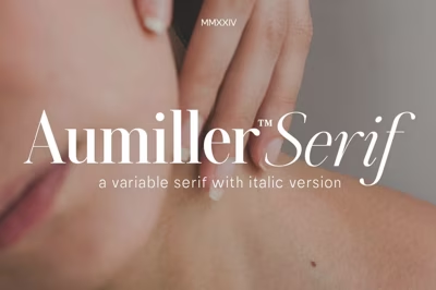
- Serif Fonts: Classic and formal, best for books, newspapers, and professional documents.
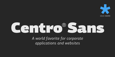
- Sans-Serif Fonts: Modern and clean, ideal for websites, presentations, and branding.
- Script Fonts: Decorative and elegant, perfect for invitations and artistic projects.
- Display Fonts: Unique and bold, great for headlines and attention-grabbing elements.
4. Consider Font Pairing
Combining fonts can create visual interest and hierarchy within your design. Choose complementary fonts that balance each other without competing for attention.
Popular Pairings:
- Serif + Sans-Serif (e.g., Playfair Display + Montserrat)
- Bold + Light (e.g., Raleway Bold + Raleway Light)
- Decorative + Simple (e.g., Pacifico + Open Sans)
5. Check Licensing and Usage
Ensure the fonts you choose are free for commercial use or have the appropriate licensing for your project.
Where to Find Free Fonts:
6. Test Different Options
Try out multiple fonts before making a final decision. Experiment with different styles, weights, and sizes to see what best suits your project.
Tools for Testing Fonts:
- Adobe Creative Cloud
- Canva
- Figma
7. Stay Consistent with Branding
If you're working on branding materials, ensure the font aligns with the overall brand identity, including color schemes and design elements.
Conclusion
Choosing the perfect font involves understanding your project's purpose, prioritizing readability, and experimenting with different styles and pairings. By following these guidelines, you can find a font that enhances your design and effectively conveys your message.


