Font Weights & Styles: When to Go Bold and When to Stay Light
Font Weights & Styles: When to Go Bold and When to Stay Light
Font selection doesn’t stop at choosing which typeface to use. The weight and style of that font—bold, light, italic, condensed—can completely transform how your message is perceived.
So how do you know when to go big and bold, and when to keep it sleek and subtle?
Let’s break down the design psychology behind font weights, explore the most common use cases, and help you apply them confidently across digital and print projects.
What is Font Weight?
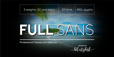
Font weight refers to the thickness of the characters. Most modern fonts come in multiple weights, usually ranging from Hairline (100) to Black (900).
| Common Weights | Typical Use |
|---|---|
| Thin / Light | Elegant, minimal, soft |
| Regular | Neutral, easy-to-read body text |
| Medium | Slight emphasis, secondary headers |
| Bold | Strong, eye-catching, high contrast |
| Black / Extra Bold | Ultra-impact, used sparingly |
The Psychology of Font Weight
-
Bold Fonts = Confidence, urgency, strength
Ideal for calls to action, headlines, or impactful statements. -
Light Fonts = Sophistication, calmness, modernity
Great for luxury brands, minimalist design, or tech-oriented aesthetics. -
Italic Fonts = Emphasis, personality, motion
Best used for quotes, subtext, or stylistic highlights—not entire paragraphs. -
Condensed Fonts = Space-saving, attention-grabbing
Useful for posters, mobile apps, or anything where space is limited.
When to Use Bold Fonts
Headlines and Titles
Whether on a website or a magazine cover, bold fonts grab attention and create a clear hierarchy.
Examples:
-
Bebas Neue Bold for posters
-
Montserrat Extra Bold for headlines
-
Roboto Bold for mobile app buttons
Calls to Action (CTA)
Bold text tells the user: “Hey! This matters.”
“Buy Now” or “Get Started” in bold adds energy and clarity.
Contrast in Design
Pair a bold heading with a regular-weight paragraph for balance and readability.
When to Use Light or Thin Fonts
Modern & Minimalist Design
Light fonts create a clean, airy feel. Perfect for tech startups, design portfolios, or spa and wellness brands.
Examples:
-
Lato Light for modern interfaces
-
Raleway Thin for minimalist headings
-
Helvetica Neue Ultralight for premium branding
Background Text & Subtitles
Lighter weights work beautifully when text is secondary to imagery or needs a softer presence.
Striking the Balance: Pairing Font Weights
Smart designers use font weights to create visual rhythm:
Header (Bold)
Subheader (Medium)
Paragraph text (Regular or Light)
This helps readers navigate content and avoids visual fatigue.
Font Pairing Tip:
Try combining:
-
Playfair Display Bold with Source Sans Pro Regular
-
Poppins Extra Bold with Roboto Light
-
Oswald Bold with Lora Regular
Font Weight Mistakes to Avoid
-
Using bold for everything: It loses impact if everything is shouting.
-
Going too light on small screens: Light fonts may become unreadable on mobile.
-
Too many weights in one design: Stick to two or three for consistency.
-
Ignoring accessibility: Low-contrast thin fonts = trouble for users with visual impairments.
How to Apply Font Weights in Practice
In most modern design tools (Figma, Canva, Adobe XD, Webflow), font weights are selectable within the font family—no need to import separate files.
Bonus Tip: Variable fonts like Inter, Roboto Flex, and IBM Plex allow fluid control over weight for even more flexibility.
Final Thoughts
Typography is tone. A bold font can shout excitement. A thin font can whisper elegance. The key is using weight as a tool—not just an aesthetic choice, but a functional one.
So next time you start a design, ask yourself:
“Should this speak loudly, or whisper with class?”
Let the font weight do the talking.


