Font Psychology: How Typefaces Influence Your Audience
Font Psychology: How Typefaces Influence Your Audience
Typography isn't just about making text readable—it's a powerful psychological tool that shapes how your audience perceives, feels, and responds to your message. Every typeface carries hidden psychological signals that influence reader emotions, build trust, and drive decision-making. Understanding font psychology can transform your marketing effectiveness, brand perception, and customer engagement. In this comprehensive guide, we'll explore how different typefaces impact the human mind and how you can leverage this knowledge to create more persuasive communications.
The Science Behind Typography Psychology
Neuroscience research reveals that our brains process typography information within milliseconds, forming subconscious judgments before we even begin reading the actual words. This rapid cognitive processing occurs in the brain's visual cortex, where font characteristics trigger emotional and psychological responses based on learned associations and cultural conditioning.
Studies using eye-tracking technology show that font choice affects reading patterns, attention spans, and comprehension rates. Serif fonts, for example, guide the eye along text lines more effectively in print media, while sans-serif fonts perform better on digital screens. These physiological responses directly impact how audiences engage with your content and retain information.
Psychological priming through typography also influences decision-making processes. When viewers encounter certain font styles, their brains automatically access associated memories and emotions, creating a psychological context that colors their interpretation of your message. This phenomenon explains why luxury brands consistently use elegant serif fonts while tech companies favor clean, modern sans-serif typefaces.
Serif Fonts: Authority, Tradition, and Trustworthiness
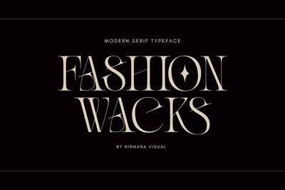
Serif fonts feature small decorative strokes extending from letter forms, creating psychological associations with tradition, reliability, and intellectual authority. These typefaces evolved from carved stone inscriptions and handwritten manuscripts, embedding centuries of cultural significance into their visual DNA.
Psychological Impact of Serif Fonts: Times New Roman triggers associations with academic authority and journalistic credibility, making it ideal for news publications and educational content. Readers perceive serif fonts as more trustworthy and established, which explains their popularity among financial institutions, law firms, and government organizations.
Georgia creates feelings of approachability while maintaining professional credibility, making it perfect for brands seeking to balance authority with warmth. Book publishers favor serif fonts because they reduce eye strain during extended reading sessions, creating positive associations with comfort and reliability.
Garamond evokes feelings of sophistication and timeless elegance, appealing to audiences who value heritage and craftsmanship. Luxury brands use Garamond-style fonts to communicate exclusivity and refined taste, targeting consumers seeking premium experiences.
Research indicates that serif fonts increase perceived credibility by up to 30% compared to sans-serif alternatives in formal contexts. However, this advantage diminishes in digital environments where screen resolution affects serif readability.
Sans-Serif Fonts: Modernity, Clarity, and Innovation
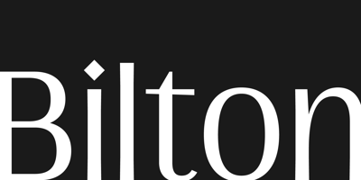
Sans-serif fonts lack decorative strokes, creating clean, minimalist appearances that trigger psychological associations with modernity, efficiency, and forward-thinking approaches. These typefaces emerged during the industrial revolution, reflecting society's shift toward mechanization and streamlined design.
Psychological Responses to Sans-Serif Typography: Helvetica generates feelings of neutrality and universality, making it psychologically "invisible" while maintaining high readability. This characteristic makes Helvetica ideal for brands wanting to avoid personality conflicts while ensuring clear communication across diverse audiences.
Arial creates impressions of accessibility and straightforwardness, appealing to audiences who value simplicity and directness. Technology companies favor Arial-style fonts because they suggest innovation without intimidation, making complex products seem approachable.
Futura triggers associations with geometric precision and futuristic vision, appealing to audiences interested in cutting-edge solutions. Brands use Futura-inspired fonts to communicate innovation leadership and technological sophistication.
Studies show that sans-serif fonts increase reading speed by 15-20% on digital screens, creating positive user experiences that translate into higher engagement rates. The psychological impact of improved usability builds subconscious trust and brand loyalty over time.
Many free font collections offer high-quality sans-serif options that deliver professional psychological impact without licensing costs. Google Fonts provides numerous sans-serif choices that maintain consistent psychological associations across different weights and styles.
Script Fonts: Personality, Creativity, and Human Connection
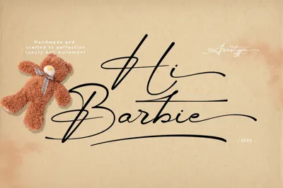
Script fonts mimic handwriting styles, triggering powerful psychological responses related to personal communication, creativity, and human authenticity. These typefaces activate brain regions associated with social connection and emotional processing, making them highly effective for building personal relationships with audiences.
Emotional Impact of Script Typography: Brush scripts create feelings of casual friendliness and approachability, making brands seem more relatable and down-to-earth. Restaurants and lifestyle brands use brush scripts to suggest homemade quality and personal attention.
Formal scripts like Edwardian trigger associations with elegance, celebration, and special occasions. Wedding planners, luxury hotels, and high-end retailers use formal scripts to create feelings of exclusivity and memorable experiences.
Handwritten-style fonts generate impressions of authenticity and personal care, particularly effective for brands emphasizing craftsmanship or individual attention. Small businesses use handwritten fonts to compete with larger corporations by highlighting their personal touch.
However, script fonts require careful psychological consideration. Overuse can trigger negative associations with amateur design or reduced professionalism. Research suggests limiting script fonts to headlines and accent text while using neutral fonts for body content.
Display Fonts: Impact, Character, and Brand Differentiation
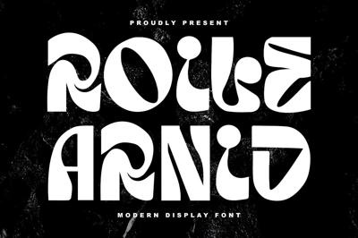
Display fonts are designed for headlines and short text, offering unique psychological characteristics that create memorable brand impressions. These typefaces often carry strong personality traits that can either strengthen or undermine brand messaging depending on alignment with audience expectations.
Psychological Characteristics of Display Fonts: Bold, angular display fonts trigger associations with strength, power, and masculine energy. Sports brands and automotive companies use angular fonts to appeal to audiences seeking performance and dominance.
Rounded, organic display fonts create feelings of friendliness, approachability, and feminine energy. Children's brands and healthcare organizations use rounded fonts to appear non-threatening and nurturing.
Distressed or vintage display fonts trigger nostalgia and authenticity associations, appealing to audiences seeking genuine experiences over manufactured perfection. Craft breweries and artisanal brands use distressed fonts to communicate heritage and handmade quality.
The psychological risk with display fonts lies in their strong personality traits. While memorable, these fonts can alienate audiences whose psychological preferences don't align with the font's characteristics. Testing display fonts with target audiences helps ensure positive psychological impact.
Cultural Psychology and Font Perception
Cultural background significantly influences font psychology, as different societies develop unique associations with typographic styles. Understanding cultural typography psychology becomes crucial for brands operating in global markets or targeting diverse demographic groups.
Cultural Variations in Font Psychology: Western cultures typically associate serif fonts with tradition and authority, while many Asian cultures view these same fonts as old-fashioned or overly formal. Sans-serif fonts often read as more respectful and appropriate in cultures valuing modesty and understatement.
Religious and spiritual associations also vary culturally. Gothic fonts may trigger positive associations with tradition and ceremony in some cultures while appearing intimidating or outdated in others. Script fonts can suggest elegance in one culture while implying informality or unprofessionalism in another.
Age demographics within cultures also respond differently to font psychology. Younger audiences often prefer modern, clean fonts that older audiences might perceive as cold or impersonal. Successful brands adapt their typography psychology to match their primary audience's cultural expectations.
Color Psychology in Typography
Font color interacts with typeface psychology to create compound emotional responses. The same font can trigger completely different psychological reactions depending on color choices, making color an essential component of typography psychology strategy.
Psychological Impact of Typography Colors: Black text on white backgrounds creates associations with authority, formality, and seriousness. This classic combination maximizes readability while triggering psychological responses related to official documents and professional communication.
Blue typography generates feelings of trust, stability, and competence, explaining its popularity among financial and healthcare brands. Different blue shades trigger varying psychological responses, from energetic cyan to calming navy.
Red text creates urgency and excitement but can also trigger stress and anxiety if overused. Marketing messages use red strategically to create psychological pressure for immediate action, but body text in red often reduces readability and creates negative user experiences.
Green typography suggests growth, health, and environmental consciousness, appealing to audiences with sustainability values. However, green text can also appear amateurish if not carefully balanced with appropriate font choices.
Typography Psychology in Digital Marketing
Digital marketing campaigns can leverage typography psychology to improve conversion rates, engagement metrics, and brand recall. Understanding how different fonts influence online behavior helps marketers create more effective campaigns across various digital platforms.
Email Marketing Psychology: Subject lines using bold, attention-grabbing fonts increase open rates by triggering curiosity and urgency psychological responses. However, many email clients don't support custom fonts, requiring marketers to rely on system fonts that still carry psychological associations.
Body text in emails benefits from highly readable fonts that create positive user experiences. Sans-serif fonts typically perform better in email marketing because they remain clear across different devices and email clients.
Social Media Typography Psychology: Instagram and Facebook posts using script fonts often generate higher engagement rates because they trigger psychological associations with personal communication. However, readability becomes crucial as users scroll quickly through feeds.
LinkedIn content benefits from professional serif or clean sans-serif fonts that trigger psychological associations with business competence and thought leadership. Playful or decorative fonts can undermine professional credibility on business-focused platforms.
Website Psychology: Homepage typography creates first impressions that influence visitor behavior throughout their site experience. Clear, professional fonts build psychological trust, while creative fonts can differentiate brands in competitive markets.
Call-to-action buttons benefit from bold, readable fonts that create psychological urgency without appearing aggressive. Testing different font styles for conversion elements helps identify psychological triggers that motivate desired actions.
Leveraging Free Font Psychology
Budget-conscious brands can access powerful typography psychology through strategic free font selection. Many free font collections offer typefaces with strong psychological characteristics that rival expensive licensed alternatives.
Google Fonts provides extensive free font libraries with detailed psychological profiles for each typeface. Designers can filter fonts by mood, personality, and psychological impact to find options matching their brand strategy.
Font pairing psychology becomes particularly important when using free font resources. Combining fonts with complementary psychological characteristics creates sophisticated typography hierarchies that guide reader attention and emotional responses.
Testing free font psychology with target audiences helps validate font choices before full implementation. A/B testing different font combinations reveals which psychological triggers resonate most effectively with specific audience segments.
Measuring Typography Psychology Impact
Quantifying typography psychology effects helps brands optimize their font choices for maximum psychological impact. Various metrics and testing methods reveal how font psychology influences audience behavior and business outcomes.
Key Performance Indicators: Reading time and scroll depth metrics indicate how font psychology affects content engagement. Fonts that create positive psychological responses typically show higher engagement rates and longer reading sessions.
Conversion rate testing reveals how typography psychology influences decision-making. Landing pages with psychologically appropriate fonts often show significantly higher conversion rates than those using inappropriate font choices.
Brand recall surveys measure how typography psychology affects memory and recognition. Distinctive fonts with appropriate psychological associations improve brand recall by up to 40% compared to generic font choices.
Testing Methodologies: Heat mapping reveals how font psychology influences reading patterns and attention distribution. Eye-tracking studies show where readers focus their attention based on typography psychology cues.
User interviews provide qualitative insights into psychological responses to different fonts. Understanding how audiences describe their emotional reactions to typography helps refine font psychology strategies.
Conclusion: Harnessing Typography's Hidden Power
Font psychology represents one of the most underutilized tools in modern marketing and brand communication. By understanding how typefaces influence human psychology, brands can create more persuasive messages, build stronger emotional connections, and drive better business results.
The key to successful typography psychology lies in aligning font choices with audience expectations and brand objectives. Whether using premium licensed fonts or carefully selected free font options, psychological appropriateness matters more than cost or complexity.
As digital communication continues evolving, typography psychology becomes increasingly important for cutting through information overload and creating memorable brand experiences. Brands that master font psychology gain significant competitive advantages in building trust, conveying personality, and motivating desired actions.
Start experimenting with typography psychology in your next design project, and watch how strategic font choices transform audience responses to your message. The hidden power of typefaces awaits your discovery.


