American Sign Lettering Inspired Fonts for Vintage Projects
American Sign Lettering Inspired Fonts for Vintage Projects
The golden age of American sign lettering, spanning from the 1900s through the 1960s, created a visual language that defined the American commercial landscape. From the bold marquees of Broadway theaters to the hand-painted storefronts of Main Street America, sign painters developed distinctive lettering styles that captured the optimism, craftsmanship, and entrepreneurial spirit of their era.
Today, these classic American lettering traditions experience a remarkable renaissance as designers seek authentic alternatives to digital perfection. Whether you're creating vintage brewery branding, retro diner graphics, or nostalgic advertising campaigns, understanding and utilizing American sign lettering-inspired fonts can transport your projects back to an era when every letter was crafted by hand and every sign told a story.
The Heritage of American Sign Lettering
American sign lettering emerged from practical necessity in the late 19th and early 20th centuries when businesses needed affordable, durable advertising that could withstand weather and attract customers from considerable distances. Sign painters developed efficient lettering techniques that balanced speed, readability, and visual impact – constraints that created remarkably consistent and effective design languages.
Regional Variations and Local Styles
Different regions of America developed distinct sign lettering characteristics that reflected local culture and commercial needs. East Coast cities favored more formal, European-influenced styles with classical proportions and refined details. The American West embraced bolder, more expressive lettering that could be read from horseback or moving vehicles. Southern states developed graceful, flowing scripts that reflected hospitality culture and leisurely lifestyles.
These regional variations created a rich vocabulary of American lettering that modern designers can draw from to create authentic period projects or contemporary designs with vintage appeal.
The Craftsman's Approach to Letter Design
American sign painters approached lettering as skilled craftsmen rather than artists, focusing on functionality and efficiency while maintaining aesthetic appeal. They developed systematic approaches to letter construction that ensured consistency across large projects while allowing for personal style and creative expression.
This craftsman mentality created lettering with distinctive characteristics: letters designed for maximum readability at distance, proportions optimized for hand-painting efficiency, and details that could be executed quickly with basic tools. These practical constraints resulted in lettering that feels both professional and human – sophisticated yet approachable.
Classic American Sign Lettering Styles
Gothic Condensed: The Workhorse of American Commerce
Gothic condensed lettering dominated American signage from the 1920s through the 1950s, providing maximum impact in minimum space. These letters featured heavy, even stroke weights with minimal contrast and condensed proportions that maximized readability while conserving expensive real estate on storefronts and advertisements.
Modern fonts like Alternate Gothic, Franklin Gothic Condensed, and Knockout capture the essential characteristics of this utilitarian lettering style. These fonts work exceptionally well for headlines, logos, and any project requiring strong visual impact with vintage American character.
Script and Brush Lettering: The Personal Touch
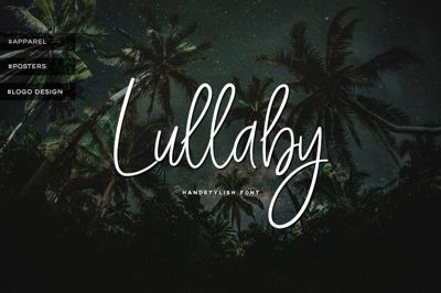
American sign painters developed flowing script styles that added personality and warmth to commercial communications. These scripts ranged from formal Spencerian influences to casual brush lettering that suggested friendly, personal service.
Contemporary fonts like Wisdom Script, Playlist Script, and Amatic SC capture different aspects of American script lettering traditions. Formal scripts work beautifully for luxury brands and traditional businesses, while casual brush styles suit modern companies seeking approachable, authentic character.
Block Letters with Personality
American sign lettering included numerous variations of block letter styles that combined the readability of simple sans-serif forms with distinctive character details. These letters often featured subtle flares, unique proportions, or decorative elements that distinguished them from purely functional typography.
Fonts like Veneer, Bevan, and Ultra represent modern interpretations of these characterful block letter traditions, providing contemporary designers with tools for creating projects that feel both vintage and completely functional.
Art Deco Influences: Geometric Glamour
The Art Deco movement significantly influenced American sign lettering from the 1920s through the 1940s, introducing geometric sophistication and glamorous details that elevated commercial signage to artistic levels. These influences appeared in theater marquees, hotel signs, and upscale retail establishments.
Modern fonts like Poiret One, Raleway, and Orbitron capture different aspects of Art Deco-influenced American lettering, providing elegant solutions for projects requiring vintage sophistication with contemporary functionality.
Industry-Specific Lettering Traditions
Automotive and Service Station Lettering
American automotive culture created distinctive lettering traditions that emphasized speed, power, and mechanical precision. Service station signs, auto dealer displays, and racing graphics developed characteristic styles that suggested technical expertise and American automotive superiority.
Fonts like Squada One, Orbitron, and custom automotive lettering styles capture these traditions while remaining highly readable for contemporary applications. These fonts work particularly well for automotive businesses, technical companies, and brands seeking to convey precision and performance.
Food and Beverage Signage
American restaurants, diners, and beverage companies developed lettering styles that suggested quality, tradition, and appetizing appeal. From the elaborate scripts of fine dining establishments to the friendly block letters of neighborhood cafes, food industry lettering balanced sophistication with approachability.
Contemporary fonts like Lobster, Pacifico, and Dancing Script provide modern interpretations of these food industry lettering traditions, offering designers authentic vintage appeal for culinary projects and hospitality brands.
Entertainment and Theater Marquees
Broadway theaters and movie palaces created some of America's most dramatic and memorable lettering, designed to be read from blocks away while conveying the excitement and glamour of live entertainment. These letters often featured elaborate serifs, dramatic proportions, and decorative elements that created visual spectacle.
Fonts like Abril Fatface, Playfair Display, and Fredoka One capture different aspects of entertainment lettering traditions, providing contemporary designers with tools for creating projects that demand attention and convey excitement.
Implementing American Sign Lettering Aesthetics
Authentic Color Palettes
American sign lettering aesthetics extend beyond letter forms to include characteristic color combinations that defined different eras and industries. The 1940s favored patriotic red, white, and blue combinations alongside earth tones like mustard yellow and forest green. The 1950s introduced optimistic pastels and bold primary colors that reflected post-war prosperity and technological advancement.
Understanding these color traditions enables designers to create more authentic vintage projects that capture not just the letterforms but the complete visual language of specific periods and industries.
Texture and Weathering Effects
Authentic American sign lettering often showed the effects of weather, age, and repeated repainting that added character and authenticity to commercial signage. Modern designers can recreate these effects through careful selection of distressed fonts or strategic application of aging effects that suggest genuine historical authenticity.
However, weathering effects should be applied judiciously – too much distressing can hurt readability and appear contrived rather than authentic. The goal is suggesting age and character rather than creating obviously artificial aging effects.
Layout and Composition Principles
American sign painters developed sophisticated approaches to layout and composition that maximized readability while creating visually appealing arrangements. These principles included strategic use of white space, careful attention to letter spacing and word spacing, and hierarchical arrangements that guided viewer attention through complex information.
Modern designers can apply these traditional principles to contemporary projects, creating layouts that feel both vintage and completely functional for current communication needs.
Free Fonts for Authentic American Vintage Projects
Google Fonts Options
Several high-quality Google Fonts capture authentic American sign lettering characteristics while providing the performance and accessibility benefits of modern web fonts:
- Fredoka One: Captures the friendly boldness of mid-century American signage
- Alfa Slab One: Provides the heavy impact of condensed slab lettering
- Righteous: Offers Art Deco-influenced geometry with contemporary functionality
- Creepster: Delivers authentic horror/carnival lettering for specialized projects
- Bungee: Captures the vertical emphasis of classic American poster lettering
Specialized Vintage Font Resources
Beyond Google Fonts, numerous specialized resources offer fonts specifically designed to recreate authentic American sign lettering:
- Font Squirrel: Provides carefully curated collections of vintage-inspired fonts with clear licensing
- DaFont: Offers extensive collections of sign lettering-inspired fonts, though licensing requires careful verification
- Open Foundry: Features high-quality vintage revivals with comprehensive character sets and professional licensing
Project Applications and Best Practices
Brewery and Distillery Branding
American craft brewing and distilling industries frequently draw inspiration from prohibition-era and mid-century signage traditions. Authentic American lettering styles help these brands convey heritage, craftsmanship, and connection to American brewing traditions while appealing to contemporary consumers seeking authentic experiences.
Successful brewery branding often combines multiple American lettering traditions – perhaps using condensed gothic letters for the primary brand name while incorporating script elements for descriptive text or special editions.
Restaurant and Hospitality Design
American diners, BBQ joints, and casual restaurants benefit from lettering that suggests tradition, quality, and down-home authenticity. Classic American sign lettering styles provide immediate visual cues that communicate these values while remaining highly functional for menus, signage, and marketing materials.
The key is choosing lettering styles that align with specific restaurant concepts – fine dining establishments might favor elegant scripts while BBQ restaurants could benefit from bold, masculine block letters that suggest hearty, satisfying food.
Event and Festival Graphics
Music festivals, county fairs, and community events often benefit from American sign lettering aesthetics that suggest tradition, celebration, and local pride. These lettering styles help events feel rooted in place and connected to American cultural traditions while appealing to diverse contemporary audiences.
Effective event graphics often layer multiple lettering styles to create hierarchical information arrangements that guide attendee attention while maintaining visual excitement and vintage appeal.
Avoiding Common Vintage Typography Mistakes
Over-Styling and Authenticity Issues
The biggest mistake in vintage typography projects is over-styling that makes period inspiration obvious rather than subtle. Authentic American sign lettering worked because it prioritized functionality over style, achieving character through practical constraints rather than decorative excess.
Modern projects work best when they capture the spirit of American sign lettering traditions rather than slavishly copying specific historical examples. The goal should be evoking period authenticity rather than creating museum pieces.
Readability and Accessibility Concerns
While vintage aesthetics are appealing, contemporary projects must meet modern readability and accessibility standards. This means ensuring sufficient color contrast, maintaining readable font sizes across all applications, and providing alternative text for critical information when decorative fonts might compromise accessibility.
Cultural Sensitivity and Historical Context
Some historical American lettering styles carry cultural associations that require careful consideration in contemporary applications. Designers should understand the historical context of lettering traditions and ensure their applications respect contemporary sensibilities while honoring authentic American design heritage.
American sign lettering traditions provide rich inspiration for contemporary vintage projects, offering authentic alternatives to generic retro styling while connecting brands and projects to genuine American cultural heritage. The key to successful implementation lies in understanding these traditions deeply enough to capture their essential character while adapting them thoughtfully for contemporary needs and sensibilities.
Whether you're designing for craft breweries, vintage-inspired restaurants, or nostalgic marketing campaigns, American sign lettering-inspired fonts provide proven solutions that resonate with contemporary audiences while honoring the skilled craftsmen who created America's distinctive commercial visual language.


